
I wrote 50+ pieces of UX content across mobile and desktop for an early-stage startup. The main challenges were: create for two user groups—Students and Instructors, localize content for English language learners, adhere to best UX writing principles. As the Content Lead, I measured UI text against heuristics in the voice and tone guide. These are some of the conversations I designed:
EMAILS
Pending Application Notification

Prompting Action Email

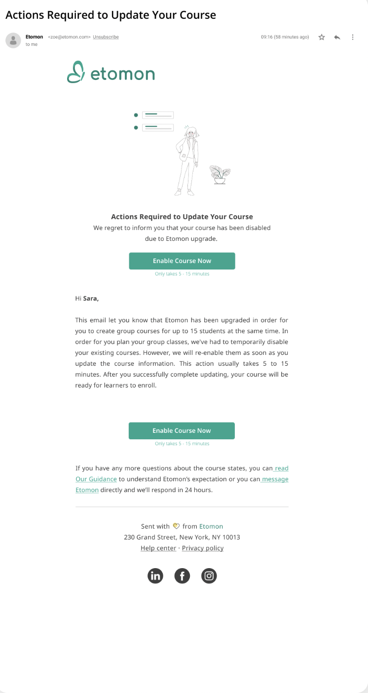
Enable Course Email

Onboarding Sign-up Flow
As an early-startup, I valued first-time users to learn about Etomon as a company, our products and services, and how we are different.
Heuristics:
Value-focused
User-focused
Cohesive
Guiding
Logical (progressive disclosure)

Action-oriented Items
Website copywriting principles were used to create landing page headlines and menu items that are clear, concise, and on-brand.
Heuristics:
Readable
Localized for Chinese speakers
Universal
Guiding

Contact Us Page
When users have questions, the text must be reassuring and inform users what to expect after submitting form.
Heuristics:
User-focused
Meaningful
Consistent

Buttons
During a content audit, it was discovered that students’ pain points included jargon, idioms, slang used in button text.
Heuristics:
Distinct (defines action)
Intuitive (sets clear expectations)
Simple
UX Writing Touch points
Creating and assessing UX content can be very subjective. It’s important to account for different perspectives in our approach to delivery product copy. A feedback cycle is a key tool. Here are some of the many UX writing touch points on the Etomon website.

Dialog
Heuristics:
Direct
Distinct
Explanatory


