Fitted is an app to motivate people into an exercise routine that suits their level, schedule, and interests.
This is a UI Design app project.

I chose this project because I wanted to try my hand at a fun, energetic UI. I created user-friendly UI that isn’t minimalistic, yet presents very solid, clear design that provides consistent and reliable rewards/incentives for the user to keep going.
Goal
Crafting accountability for people who are new or returning to fitness
Users
Ideal users would be beginners who are new or returning to fitness, want to find activities they like, and get into a good routine will be interested in Fitted.

Process
User research was completed prior. UI is the main focus. During the initial stages the focus was on building a user flow, creation of mood board and style guide, and iconography that lead into wireframing and prototyping.

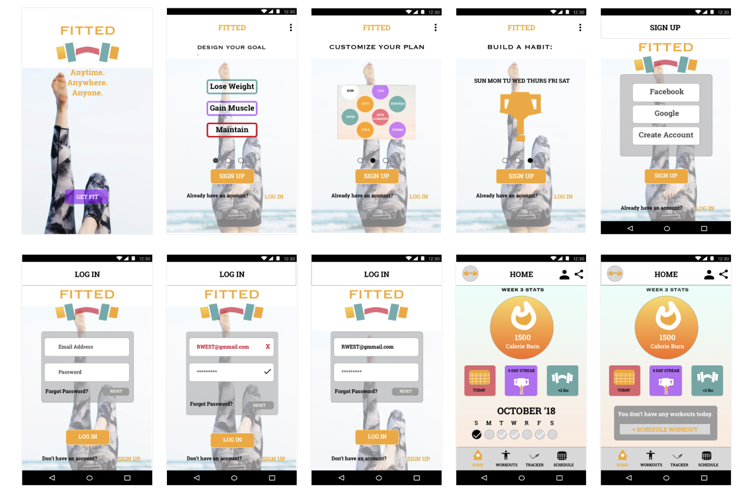
Persona Example
Rebecca is a 26 year old mother and software developer. She has a busy schedule, and wants to lose weight. She needs a tool that will teach her how to properly exercise and recommend routines she will enjoy.

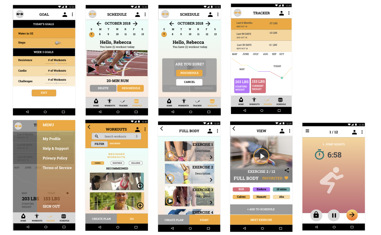
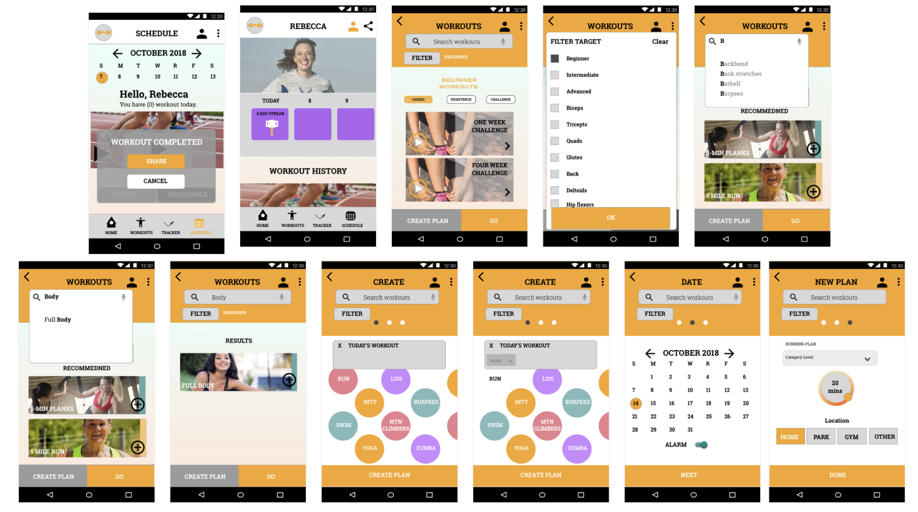
User Flow
I created a path taken by a prototypical user on the app to complete a task. The user flow takes them from their entry point through a set of steps towards their successful goal. In this case, the goal is for Rebecca to successfully complete a workout.

Mood Board & Style Guide
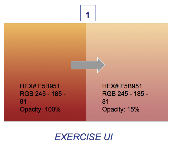
The different colors will draw the user’s eye to different exercise routines as the browse and schedule accordingly. The primary color white signifies simple, pure, and minimal. This will balance the use of bright expressive colors such as orange and yellow conveys an adventures, cheerful vibe while the green, purple, and red are tertiary colors used to differentiate different exercise routines. For example, green will be used for recovery and low-intensity routines as green signifies calm and restful.
Color Palettes


UI Elements

Iconography


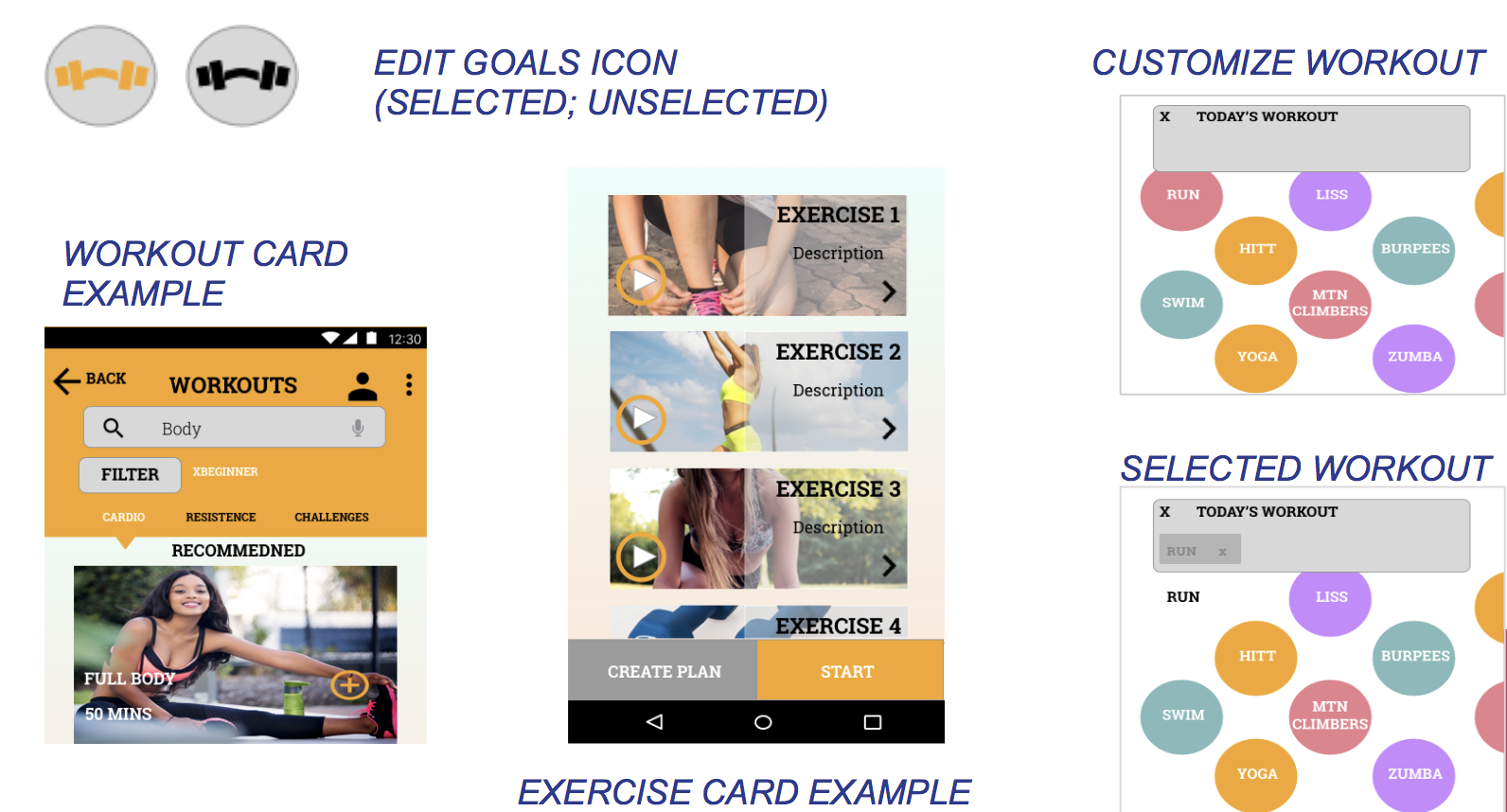
Final Showcase